
Leveling Up The Castaway Journey
About
As a huge fan of retro pixelated games, Castaway has quickly become my favorite, which sparked my interest in how it was promoted. I encountered challenges finding the official website, often being redirected to other companies’ sites. This experience highlighted the need for a more accessible platform. My goal for the redesign is to create a user-friendly website that streamlines navigation, making it easier for users to access information about the game and purchase it directly.
Role
Web design
Typography/Color Palette

The color palette is inspired by my research on retro games, which often feature vibrant, eye-catching hues that not only appeal to younger audiences but also create a light-hearted atmosphere. These colors perfectly complement the adventurous spirit of the game. Paired with the fonts I selected, the design conveys a sense of excitement and adventure. The header grabs attention with its bold and easy-to-read style, while the body font reflects the game’s retro aesthetic, maintaining the distinctive vibe and playful tone of the design.

Wire Frames


Assets
Pagitation
I aimed for the website to feel like a part of Castaway, so I designed a carousel on the left that resembles the game's gems and weapons. For the final design, I simplified the layout and changed the color to blue, ensuring that viewers could enjoy the site without confusion, while also aligning with the game's aesthetic.

Exploration

Final
Buttons
I aimed for the website to feel like a part of Castaway, so I designed a carousel on the left that resembles the game's gems and weapons. For the final design, I simplified the layout and changed the color to blue, ensuring that viewers could enjoy the site without confusion, while also aligning with the game's aesthetic.
Exploration
Final

Cards
I aimed for the website to feel like a part of Castaway, so I designed a carousel on the left that resembles the game's gems and weapons. For the final design, I simplified the layout and changed the color to blue, ensuring that viewers could enjoy the site without confusion, while also aligning with the game's aesthetic.


Exploration
Final
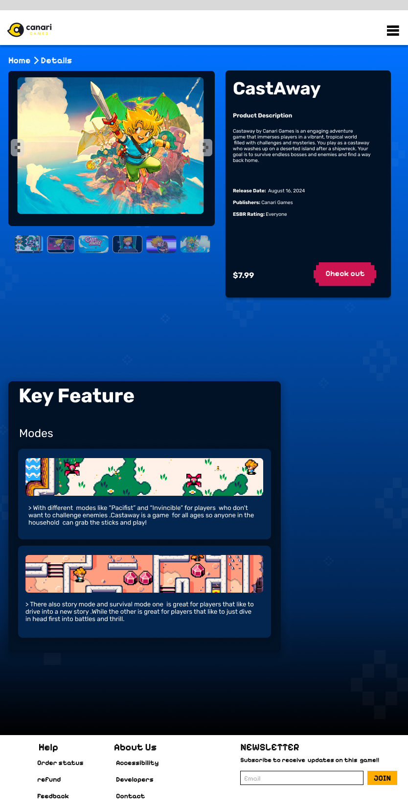
Final screens
The landing page design delivers comprehensive game information in an organized and digestible way. Each scroll introduces a new component, allowing viewers to absorb the content without feeling overwhelmed, creating a smooth and engaging experience as they explore Castaway.
Desktop


Tablet home page
Tablet checkout page
Phone home page

Phone


Tablet


Conclusion
Overall, I thoroughly enjoyed working on this project and redesigning the Castaway website. Every font, asset, and button was thoughtfully chosen, with many iterations leading to the final design. One of my biggest challenges was avoiding a close adherence to the original design. However, after stepping back and doing more research, I successfully addressed the company’s need for a welcoming and exciting experience that draws people in and heightens their interest in the game.